Time-of-day usage tracking tips

Monitor your time-of-day usage with MyHydro
If you're on a time-of-day rate plan, you'll want to be thoughtful about when you use electricity. The tracking tools available in your online MyHydro account allow you to see trends and identify opportunities to shift and save.
Log in to your account regularly to track and understand your time-of-day usage patterns.
Haven't registered yet? Create a MyHydro profile first.
Monthly view
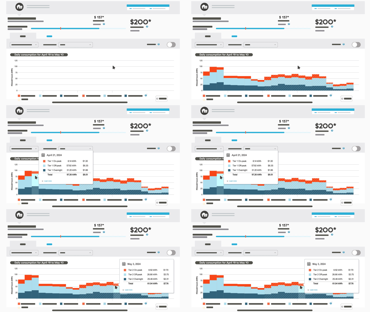
In MyHydro, the monthly view provides a summary of your usage across every day in the billing period.
What it shows you:
- How much you used: The height of the bars in the graphs indicates total usage in kilowatt-hours (kWh) per day.
- When you used it: The colours on each bar show you a visual comparison of how that day's usage was split between the three time-of-day billing periods.

What to look for:
- Days with a lot of on-peak usage: Those are days when you use the most electricity during the expensive period. Monitor this monthly to see if your household is sticking to smart time-of-day habits.
- Days with a lot of overnight usage: On those days, you used the most electricity during the discounted period. Keep it up!
- When you hit Tier 2: If you’re on the tiered rate plan, then when the bar graph changes to the striped pattern, that shows you passed the Tier 1 pricing threshold and are now paying higher prices for all usage. Some customers in smaller homes never reach Tier 2, and if you’re on the flat rate plan, tiered pricing doesn't apply.
Remember, off-peak usage has no discounts or surcharges. Standard Energy Charges apply during the off-peak period.
Hourly view
To see your hourly data, click or tap on any of the daily bars in the graph. This will open up your hourly usage breakdown for that day.

What it shows you:
- How much you used: The height of the bars in this graph indicates how much electricity you used during that hour.
- When you used it: The colour of the bar indicates which time-of-day billing period it's in.
What to look for:
- On-peak bars: The lower these are, the better, because it's the expensive period of the day. All on-peak usage counts toward your total surcharge for the billing period. Consider if any of your usage during those hours could be moved to the off-peak period to reduce your surcharge.
- Off-peak bars: You're not paying any additional surcharge for usage during this time, but you’re not getting a discount either. Consider if any usage during these hours could be shifted to the overnight period to get discounted pricing.
- Overnight bars: High bars are better here because you get a discount. All overnight usage counts towards your total discount for the billing period.
Get more detailed data
The graphs available in MyHydro show your usage down to the hour, up to the previous day.
If you're keen for more detailed and recent data, check out our free HydroHome mobile app. Features include:
- Customize alerts based on the time of day, budgeting, and more.
- Get a breakdown of usage by system or device.
- Purchase a hub to unlock more advanced features including real-time electricity use data.
Tips to shift and save
There are many ways to shift your household usage to different times of the day to get the most out of your time-of-day rate plan.